The RFI Dashboard gives you a real-time view of RFI activity across all active projects, highlighting volumes, statuses, due dates, impacts, and resolution trends. It includes visual charts that break down RFIs by status, contractor, due date, response time, and more.
Use filters to focus on specific categories such as status, contractor, cost impact, or schedule effect. With cross-filtering, selections made in one chart instantly refine all others—making it easy to drill down, uncover patterns, and analyze related data. For more details, see Cross Filtering Options.
To view the Portfolio-Level RFI Dashboard
- Ensure you are in the Portfolio console, If not:
- Click the app launcher icon
 in the top-right and select 'Portfolio.'
- Click the app launcher icon
- Click 'Analytics' at the top
The RFI dashboard opens by default. If not, click RFI Dashboard on the left.
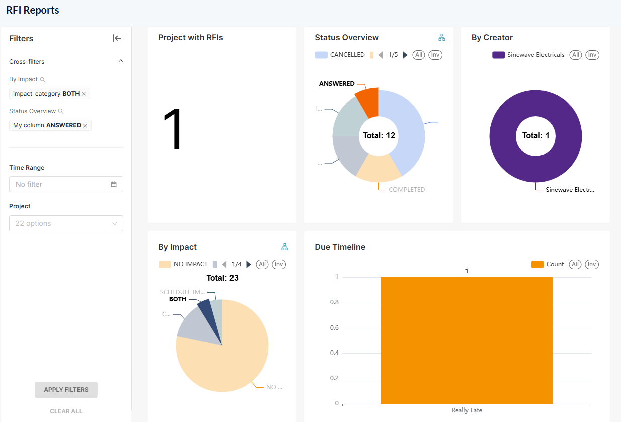
The dashboard shows the following cards and charts:
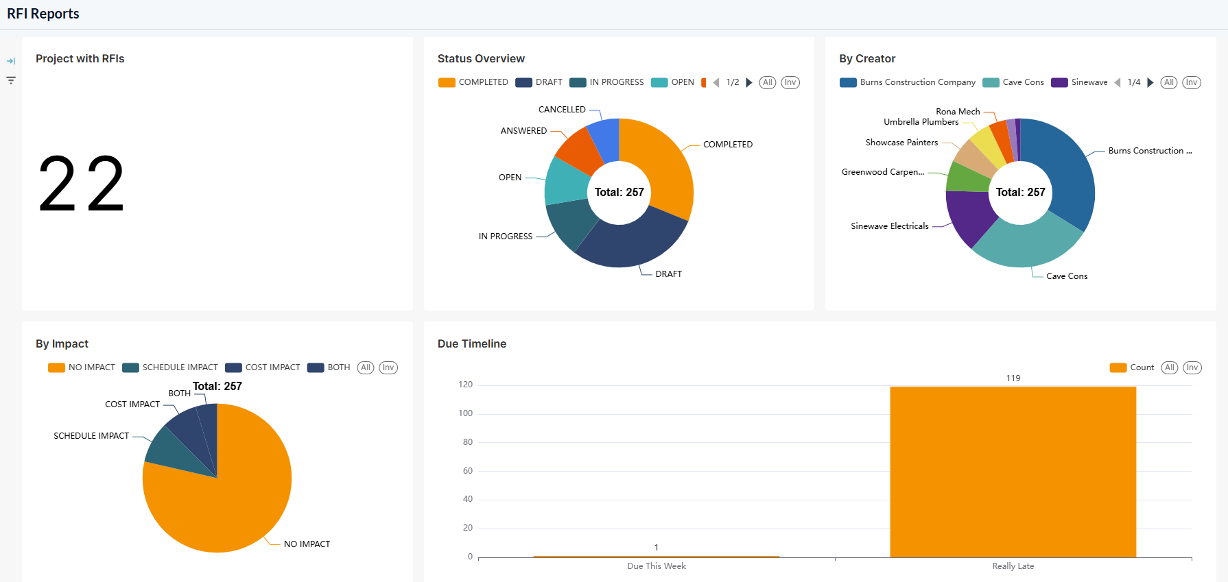
- Project with RFIs- Total number of projects that have at least one RFI, regardless of their status.
- RFI Distribution by Status
- RFI Distribution by Creator
- RFI Distribution by Impact
- RFI Count by Due Status
- RFI Status by Project
- Average Resolution Time by Project
- RFI Impact by Project
- RFI Count by Project
- RFI Resolution timeline (Created vs Closed)
Use the following links to learn about chart functions and filtering options:
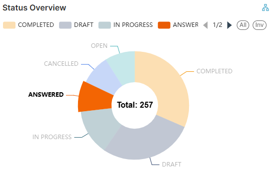
RFI Distribution by Status
The donut chart shows the summary of the numbers of RFIs based on their workflow stages and resolution status.
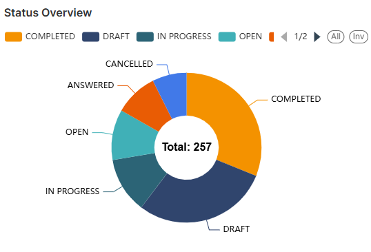
The legends are shown at the top.
- Use the left and right arrows to scroll the legend strip
- Hover your mouse over a sector to view the number of RFIs in that status, along with their percentage share of the total RFIs.
- See Cross Filtering Options to focus on particular data on the chart.
RFI Distribution by Creator
The donut chart shows the breakdown of the RFIs created by different subcontractors.
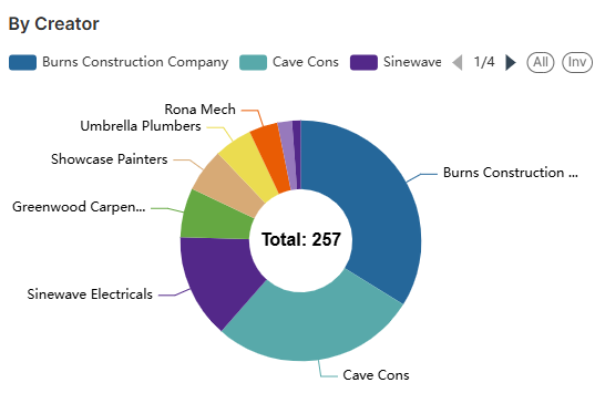
The legends are shown at the top.
- Use the left and right arrows to scroll the legend strip
- Hover your mouse over a sector to view the number of RFIs created by that contractor, along with their percentage share of the total RFIs.
- See Cross Filtering Options to focus on particular data on the chart.
RFI Distribution by Impact
The pie chart provides a summary of the number of RFIs based on their impact on the project schedule and the budget.
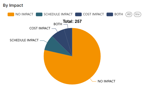
- Use the left and right arrows to scroll the legend strip
- Hover your mouse over a sector to view the number of RFIs with a particular impact type with their percentage share of the total RFIs
- See Cross Filtering Options to focus on particular data on the chart.
RFI Count by Due Status
The bar chart displays the number of RFIs categorized by due dates.
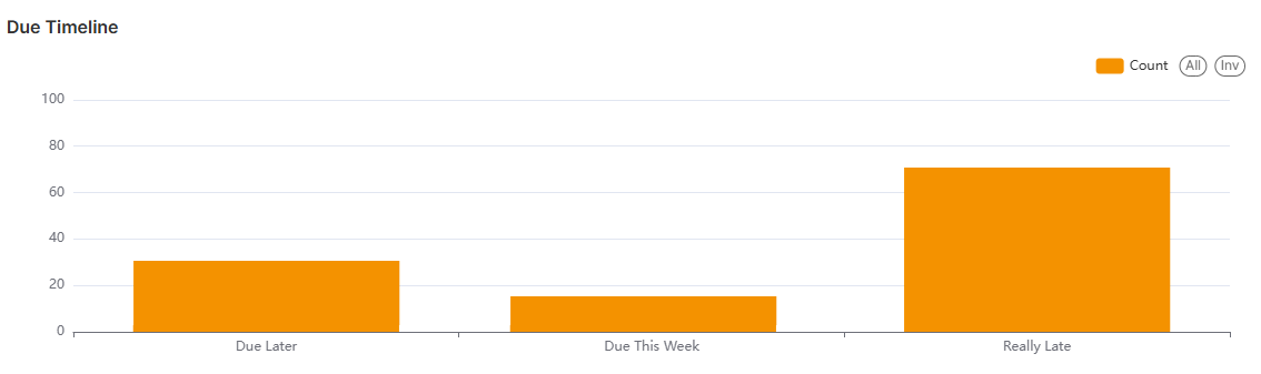
- Place your mouse on a bar to view the number of RFIs in that due category
- Really Late - The number of RFIs that are outstanding and overdue from the period before the previous week
- Late Last Week - The number of RFIs that are outstanding and overdue from the previous week
- Due this week - The number of RFIs that are due within the current week
- Due Later - The number of RFIs that are not overdue
- See Zoom and Filtering Options to focus on particular data on the chart.
RFI Status by Project
The bar chart shows the list of projects and the number of RFIs by status, like draft, in progress, answered, and completed.
 Place your mouse on a bar to view the number of RFIs in various statuses in that project.
- See Zoom and Filtering Options to focus on particular data on the chart.
Average Resolution Time by Project
- The bar chart shows average resolution days for every project based on the resolved RFIs.
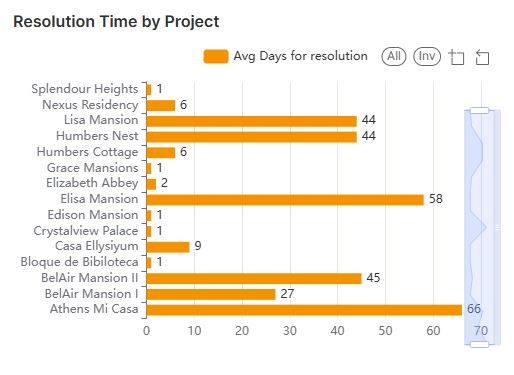
- Place your mouse over the bar to view the average number of days taken to resolve an RFI in that project.
- See Zoom and Filtering Options to focus on particular data on the chart.
RFI Impact by Project
The bar chart shows the project-wise summary of the numbers of RFIs broke down based on their impact on the project schedule and the budget.
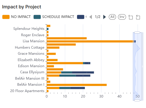
- Place your mouse over the bar to view the number of RFIs with their impact type and the percentage share of the total RFIs
- See Zoom and Filtering Options to focus on particular data on the chart.
RFI Count by Project
The bar chart shows the total number of RFIs present in each project
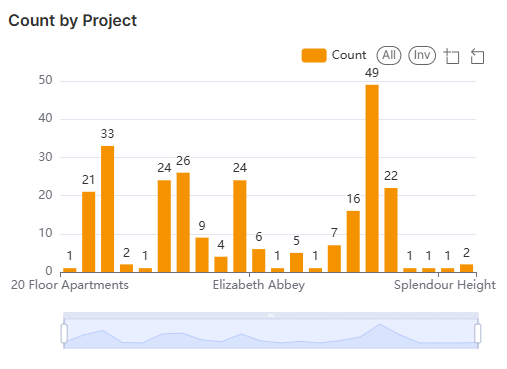
- Place your mouse over the bar to view the number of RFI in that project.
- See Zoom and Filtering Options to focus on particular data on the chart.
RFI Resolution timeline (Created vs Closed)
The bar chart shows the total number of RFIs created vs the number of RFIs closed each month
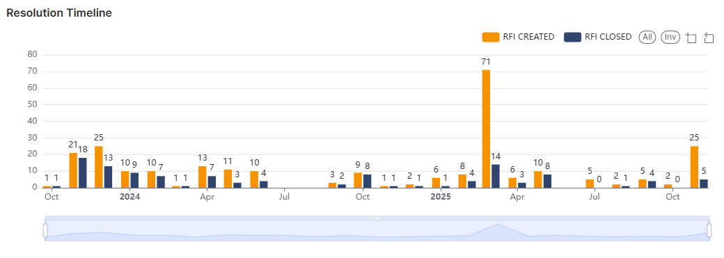
- Place your mouse over the bar to view the number of RFIs created or closed
- See Zoom and Filtering Options to focus on particular data on the chart.
Cross Filtering Options
The cross-filtering feature enables you to choose a category on one chart and instantly apply that category as a filter across all visualizations. This action refines the data displayed in the other charts, showing only the statistics related to the selected category of RFIs. Additionally, you can layer multiple filters by selecting different sectors across the charts, allowing for deeper, more specific analysis of the filtered results.
Note: You can add custom filtering options only from the donut/pie charts and the tables in the dashboard.
- Click on any sector within the donut charts to filter other charts with that category as filter criteria
- Repeat the process on the other charts successively to drill down into the results
The Filters pane on the left shows the successively applied filters
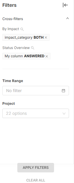
- Click the 'X' mark beside a filter to remove it.
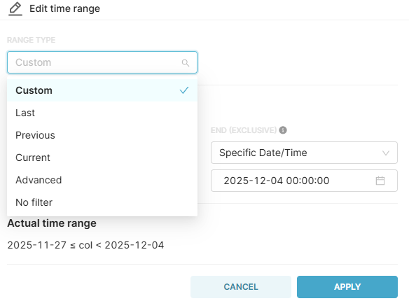
Filter by Time Range
- Click the 'Time Range' filter
- Select the range type from the drop-down menu and choose the desired time range
You can also set a custom time range with specific date and time
- Click the'Apply' button to set the filter for the selected time range
Illustration
For example, if you want to view statistics of RFIs that are in 'Answered' status, have both schedule and cost impact, you can cascade these two filters from the respective charts:
- Click the 'Answered' sector in the 'RFI Status' chart
All charts are filtered to show only the statistics of RFIs that are in progress.
- Then click 'Both Impact' in the RFI Impact chart
The charts now show only the RFIs that are in progress and have both cost and schedule impact.
The 'Filters' pane on the left shows the filters applied in order.
- Click the 'X' button beside a filter to remove it
Zoom and Filtering Options
Zoom option:
This function is applicable to all bar charts to get a precise view of a particular area.
- Use the sliders at the bottom or sides of the range bar to zoom the chart to the required timeline
- Click
 , drag, and select an area to zoom in to view data on that particular area
 - Click
 to reset the zoom
Filtering options:
Filtering options are available for both pie charts and bar charts.
- Click on the legends at the top of the particular chart to hide/show those categories in the chart. This filter option is applied only to that particular chart.
- Click 'All' to clear all filters and show all categories
- Click 'Inv' to invert your selection of categories
Was this article helpful?
That’s Great!
Thank you for your feedback
Sorry! We couldn't be helpful
Thank you for your feedback
Feedback sent
We appreciate your effort and will try to fix the article