The Submittals Dashboard provides a consolidated view of all submittal activity within a project, helping you monitor request volumes, due dates, approval progress, and overall workflow status. It presents key metrics through interactive charts that surface trends in submittal requests and responses. The information shown adapts to your project role, ensuring that every user sees the insights relevant to their responsibilities.
- General Contractors – Access complete submittal statistics for the entire project.
- Subcontractors, Architects, and Other Stakeholders – View statistics only for the submittals in which you are directly involved as a creator, assignee, reviewer, or approver.
You can filter the charts by status, type, contractor, and more to focus on the details that matter. Cross-filtering allows chart selections to update related visuals, helping you quickly narrow down data and understand patterns at a glance. For more information, see Cross Filtering Options.
To open the submittal dashboard
- Ensure you are on the Submittals module of the project. If not.
- Click the app launcher icon
 in the top-right and select 'Documents.'
 - Click 'Submittals' on the top and 'Dashboard' on the left
- Click the app launcher icon
The Dashboard opens by default.
- Click 'Dashboard' on the left to return to the Dashboard screen from any other screen
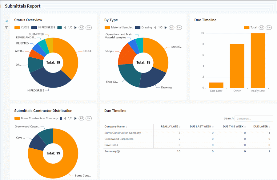
The dashboard shows the following cards and charts:
- Submittal Status Distribution
- Submittal Type Distribution
- Submittal Count by Due Status
- Submittal Contractor Distribution
- Resolution Timeline
Submittal Status Distribution
The donut chart shows the summary of the number of Submittals based on their process stages and resolution status.
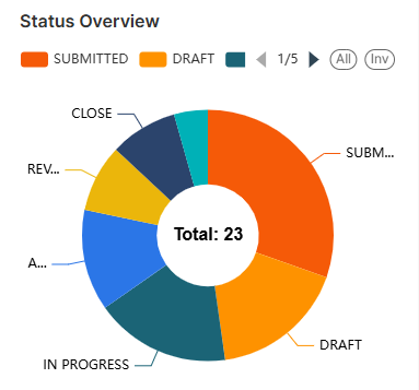
The legends are shown at the top.
- Use the left and right arrows to scroll the legend strip
- Hover your mouse over a sector to view the number of Submittals in that status, along with their percentage share of the total.
- Click on a sector to set that status as a filter and apply that as filter criteria to other charts. See Cross Filtering Options to learn more about this.
Submittal Type Distribution
- The donut chart shows the breakdown of Submittals based on the form in which they are requested/submitted.
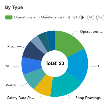
The legends are shown at the top.
- Use the left and right arrows to scroll the legend strip
- Hover your mouse over a sector to view the number of Submittals in that category, along with their percentage share of the total.
- Click on a sector to set that type as a filter and apply that as filter criteria to other charts. See Cross Filtering Options to learn more about this.
Submittal Count by Due Status
The bar chart shows an at-a-glance summary of the number of submittals that are due and overdue for the current week.
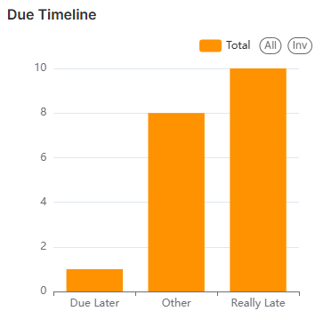
- Place your mouse on the chart to view more details.
- Really Late - The number of submittals that are outstanding and overdue from the period before the previous week
- Late Last Week - The number of submittals that are outstanding and overdue from the previous week
- Due this week - The number of submittals that are due within the current week
- Due Later - The number of submittals that are not overdue
- See Zoom and Filter Options to focus on particular data on the chart.
Submittal Contractor Distribution
The donut chart shows the breakdown of the Submittals based on the contractors and vendors who created the entries in Linarc. The table on the right shows the number of outstanding submittals.
- Company Name - The name of the subcontractor company
- Really Late - The number of Submittals that are outstanding and overdue from the period before the previous week
- Late Last Week - The number of Submittals that are outstanding and overdue from the previous week
- Due This Week - The number of Submittals that are due within the current week
- Due Later - The number of Submittals that are due after the current week
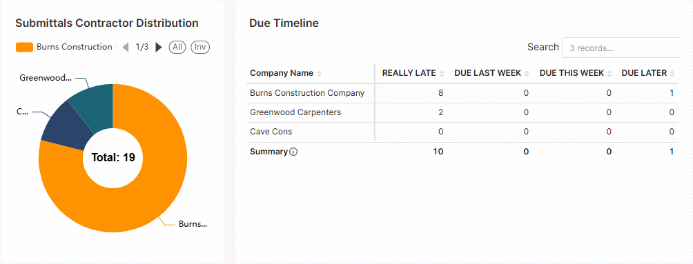
The legends are shown at the top.
- Use the left and right arrows to scroll the legend strip
- Hover your mouse over a sector to view the number of Submittals created by that contractor, along with their percentage share of the total submittals. Click on a sector to set that contractor as a filter and apply the same as filter criteria to other charts. See Cross Filtering Options to learn more about this.
Resolution Timeline
The graph shows the month-wise comparisons of the number of submittals that were responded to and delayed. This assists the project managers in having a tab on pending submittals that need attention.
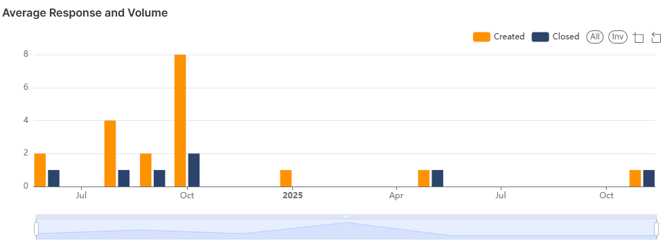
- Hover over a month to see detailed statistics of Submittals created and closed during that month
- See Zoom and Filter Options to focus on particular data on the chart.
Cross Filtering Options
The cross-filtering feature enables you to choose a category on one chart and instantly apply that category as a filter across all visualizations. This action refines the data displayed in the other charts, showing only the statistics related to the selected category of Submittals. Additionally, you can layer multiple filters by selecting different sectors across the charts, allowing for deeper, more specific analysis of the filtered results.
Note: You can add custom filtering options only from the donut/pie charts and the tables in the dashboard.
- Click on any sector within the donut charts to filter other charts with that category as filter criteria
- Repeat the process on the other charts successively to drill down the results.
The Filters pane on the left shows the successively applied filters
- Click the 'X' mark beside a filter to remove it.
Illustration:
For example, you want to view statistics of submittals that are 'In Progress' status and of 'Shop drawings' type, you can cascade these two filters from the respective charts:
- Click the 'In Progress' sector in the 'Submittals Status Distribution' chart
All charts are filtered to show only the statistics of submittals that are in progress.
- Then click 'Shop Drawings' in the 'Submittal Type Distribution' chart
The charts now show only the Submittals that are in progress and of the 'Shop drawings' type.

The 'Filters' pane on the left shows the filters applied in order.
- Click the 'X' button beside a filter to remove it
Zoom and Filter Options
Zoom option:
This function is applicable to all bar charts to get a precise view of a particular area.
- Use the sliders at the bottom or sides to zoom the chart to a required timeline
- Click
 , drag, and select an area to zoom in to view data on that particular area
 - Click
 to reset the zoom
Filtering options:
Filtering options are available for both pie charts and bar charts.
- Click on the legends at the top of the particular chart to hide/show those categories in the chart. This filter option is applied only to that particular chart.
- Click 'All' to clear all filters and show all categories
- Click 'Inv' to invert your selection of categories
Was this article helpful?
That’s Great!
Thank you for your feedback
Sorry! We couldn't be helpful
Thank you for your feedback
Feedback sent
We appreciate your effort and will try to fix the article